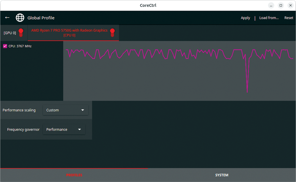
From this week's Linux Update: Erik Bärwaldt looks at tuning tools CoreCtrl and RadeonTop to potentially boost performance of AMD chips
https://www.linux-magazine.com/Issues/2025/297/Tuning-for-AMD-GPUs?utm_source=mlm
#AMD #performance #graphics #chips #RadeonTop #CoreCtrl #tools #OpenSource #monitoring #FOSS
#graphics
See tagged statuses in the local BookWyrm community
From last week's Linux Update newsletter: Michael Williams shows you how to build graphic elements into your Python programs with the Cairo graphics library
https://www.linux-magazine.com/Issues/2025/296/Graphics-in-Python-with-Cairo?utm_source=mlm
#Python #graphics #Cairo #tutorial #programming
New AMD update for Linux kernel 6.18 focuses on power management, display handling, and hardware support for Radeon GPUs
https://www.linux-magazine.com/Online/News/AMD-Initiates-Graphics-Driver-Updates-for-Linux-Kernel-6.18?utm_source=mlm
#AMD #Linux #kernel #display #graphics #driver #hardware #Radeon #GPU #desktop #server
#graphics I’m looking for somebody to draw a few (10-15) #images for an open source tech talk end September. #FediHire & fairly paid.
Basically I want some nice bright sketches of servers, and some cute swervy curvy arrows and network data flow between them, instead of the usual bland PowerPoint feels. Each image will build on the prior one.
Occasional use of fire 🔥 will be appropriate!
I will provide hand drawn examples and accompanying text clarification, but not prescriptive! It should have a strong human/hand made vibes.
Slide your email & link to something of yours into my DMs, or fwd to interested parties!
The Author Bundle: d3.js, leaflet.js and Pi https://leanpub.com/b/theauthorbundle by Malcolm Maclean is the featured bundle of ebooks 📚 on the Leanpub homepage! https://leanpub.com #Software #D3Js #Graphics #books #ebooks
The following 3 books are included in this bundle...
D3 Tips and Tricks v3.x, Leaflet Tips and Tricks, and Raspberry Pi: Measure, Record, Explore.
Find it on Leanpub!
Sometimes I relax by making colorful graphics. #color #ColorADay #graphics #AuthorLife #author #Bookstodon #books #BookTok #booksky #Bookstagram
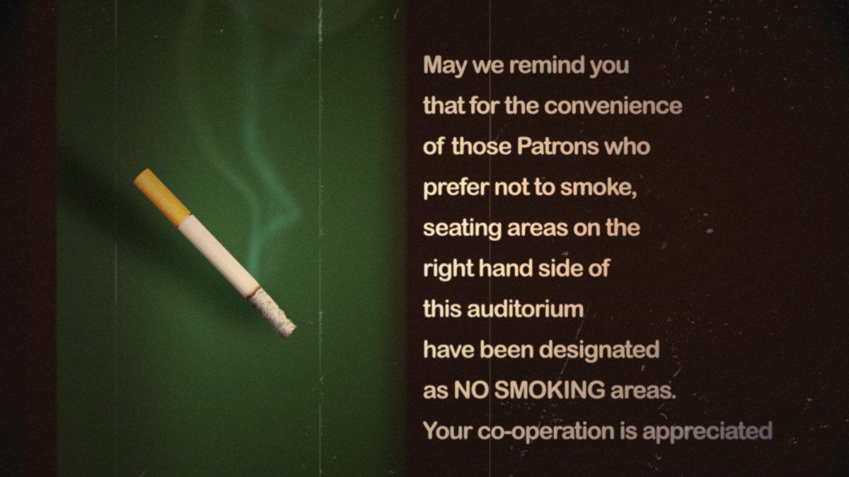
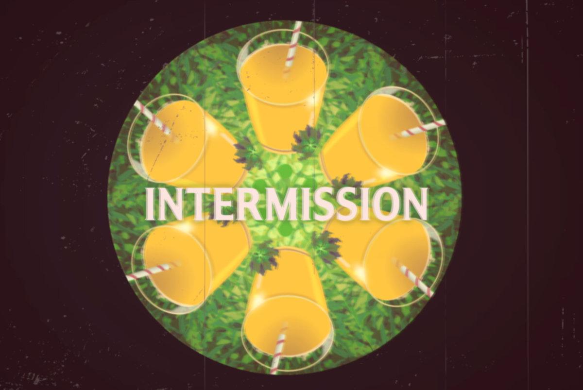
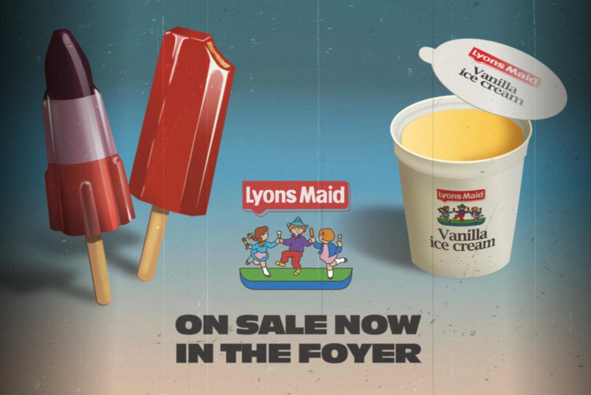
Frankly, I don't know what possessed me, but I decided to recreate 1970s cinema intermission screens as vector graphics with the rule that everything had to be 100% vector. No raster graphics, no photographs, no post-vector treatments.
1/2
#graphics #vectorgraphics #cinema #1970s #illustration
Made a short video how to easily achieve panels with borders in SDF Modeler…
https://www.youtube.com/watch?v=TO4qu9eJfOA
Grab SDF Modeler for free here (Win / macOS / Linux):
https://sascha-rode.itch.io/sdf-modeler
#SDFModeler #SDF #3D #3DModeling #3DRendering #CGI #graphics #editor #app #apps #tools #software #FreeSoftware #free #apple #Mac #macOS #linux #windows #tip #tips
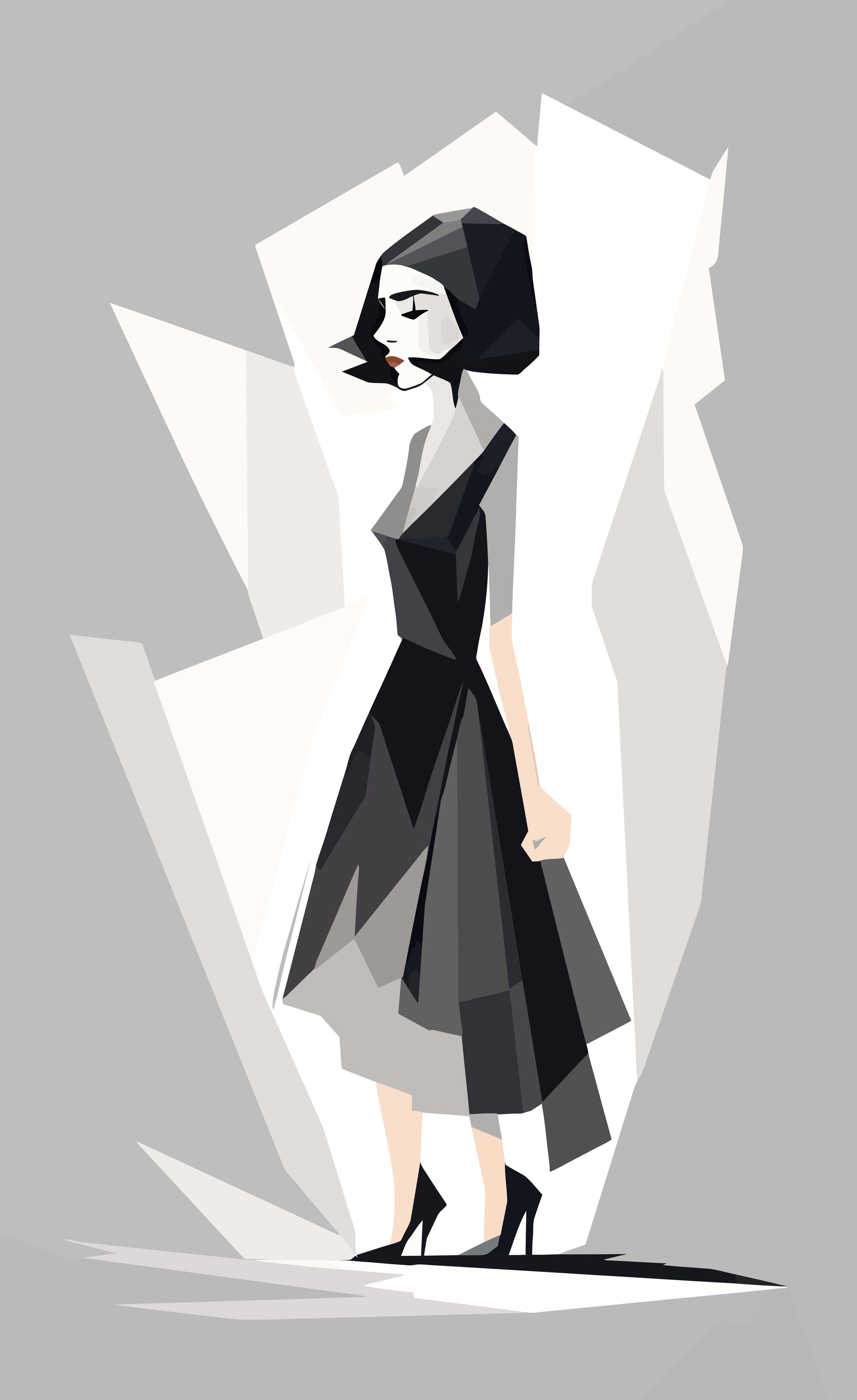
#Orbite #ART #ARTE
#ARTWORK #minimalism #drawing #beautiful #style #illustration #graphics #elegance #lowpoly #Woman #shorthair
Note "WPAP style drawing, young beautiful woman with short hair"
Learn D3.js Bundle https://leanpub.com/b/learn-d3js-bundle by Peter Cook is the featured bundle of ebooks on the Leanpub homepage! https://leanpub.com #Graphics #Javascript #D3Js #DataScience #WebDevelopment #html #css #books #ebooks
Here is a preview design for a (business) card promoting the Fediverse (made in Inkscape).
I plagiarized the idea from @juergen_hubert@mementomori.social who has created card templates people can print and give out at protests.
Instead, i'm doing fully designed cards for more generic use. Lending my graphic design skills to the community. I will put these out as print ready files under a (non-commercial) Creative Commons license - so anyone can get a stack cheaply printed themselves to give out places or leave in coffee shops etc.
If there is interest, I will do a bunch of different designs, different languages, and a US size (I'm designing to EU standards). Plus maybe some stickers and posters too?
This particular design is my trademark 'busy with movement' style. I've based the design on the colours and shapes from the official Fediverse logo.
#fediverse #fedi #fedicard #fedihelp #graphicdesign #graphics #inkscape #fedipromo #creativecommons
After 20 years, PNG (yes the file format) gets an update. Nice! https://www.programmax.net/articles/png-is-back/
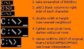
Here's how I edit screenshots of the 80*25-character VGA text mode to simulate the CRT look:
1) Take a screenshot of DOSBox. (It has square pixels and no extra pixel column between the 8*16-pixel characters.)
2) Add 1 black column to the right side of each character. (VGA does this in some text modes.)
3) Double the width and the height. Use nearest neighbour interpolation.
4) Make every 2nd pixel row of the characters lighter and the rest darker. This simulates the gaps between the horizontal sweeps of the electron beam.
5) Aspect ratio correction: Resize the width to 20/27 of the original. Keep the original height. Use linear interpolation. The ratio comes from (4/3)/((80*9)/(25*16)) where 4/3 is the aspect ratio of old screens and (80*9)/(25*16) is the aspect ratio of the image with square pixels.
#tutorial #graphics
Got Rust running on the PSP 🦀
@ratatui_rs is next... 🐭
https://github.com/overdrivenpotato/rust-psp
#rustlang #psp #homebrew #graphics #gamedev #pspsdk #ratatui
A brief history of 3D CGI…
1991: ILM
2025: LLM
#3D #3DModeling #CGI #graphics #design #artwork #sculpture #3DArt #3DModeling #3DArtist #animation #DigitalArt #digital #art #artist #arts #arte #Blender3D #B3D #blender

