


Content warning nitpicking, continuity
I see, i see. You »put the car into drive«, but it also has a gear shifter.

I may or may not use Simplified Spelling Board rules in my notes.
This link opens in a pop-up window
Content warning nitpicking, continuity
I see, i see. You »put the car into drive«, but it also has a gear shifter.
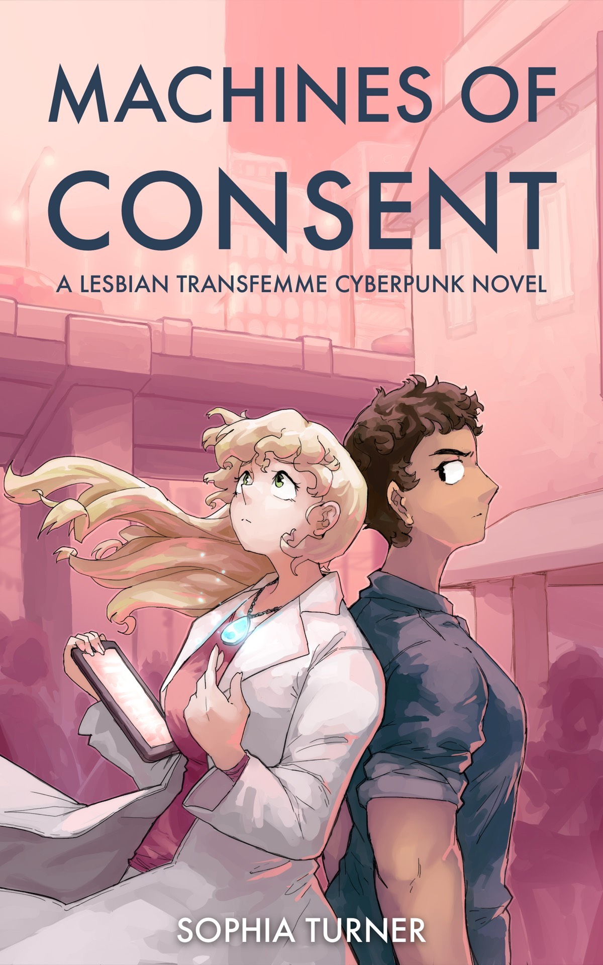
Dr. Jess Stockton is a scientist with high goals and even higher ambitions. Through her …
the (...) growl of the motor (...) Jess shifted gears (...) Roh cranked over the engine,
— Machines of Consent by Sophia Turner (Page 82)
Eh. A bit surprising to find cars with internal combustion engines end even manual gear shift in a cyberpunk novel. No, i was not expecting flying cars powered by techno-babble, but at most electric ones, and those being more of an oddity then it being a luxury thing if you got a fancy one.
Eh. A bit surprising to find cars with internal combustion engines end even manual gear shift in a cyberpunk novel. No, i was not expecting flying cars powered by techno-babble, but at most electric ones, and those being more of an oddity then it being a luxury thing if you got a fancy one.
Dr. Jess Stockton is a scientist with high goals and even higher ambitions. Through her …
“(W)hat it will do is tell us if there’s a tracker there to begin with. (...)” “Oh right, before we begin, phones off.”
— Machines of Consent by Sophia Turner (Page 78)
... So, they are looking for a tracker on a person. Beside the phone. O ... kay‽ Why bother with a special tracker when everybody is using cellphones?
... So, they are looking for a tracker on a person. Beside the phone. O ... kay‽ Why bother with a special tracker when everybody is using cellphones?
Dr. Jess Stockton is a scientist with high goals and even higher ambitions. Through her efforts, she has created a …
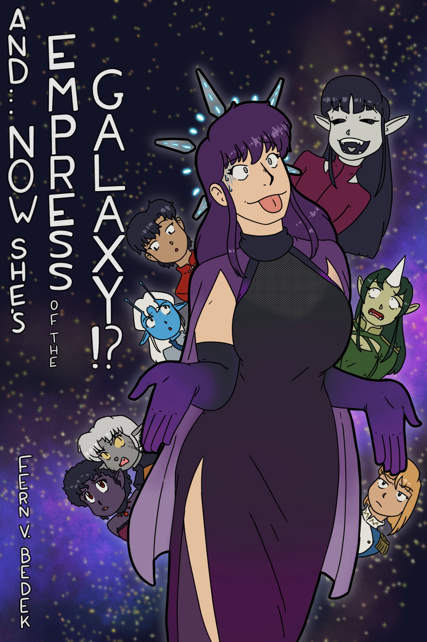
Svetlana has finally properly gone to space, to inherit her title of Empress of the …
So, yeah. Less of The Genders then i was expecting. Svetlana after all is just happy as a woman. So we basically have just a space opear. Also, the editing wasn't all that good at the end. I don't know what »my idiot sirent« is supposed to mean.
So, yeah. Less of The Genders then i was expecting. Svetlana after all is just happy as a woman. So we basically have just a space opear. Also, the editing wasn't all that good at the end. I don't know what »my idiot sirent« is supposed to mean.
Svetlana has finally properly gone to space, to inherit her title of Empress of the Galaxy. And she's brought her …
I ges you could use an English pronunciation as a compromise, something like /ɔːˈɡʌstiː/
Svetlana has finally properly gone to space, to inherit her title of Empress of the …
Content warning nitpicking, names
The name ‘Auguste’ had been very easy to shift to. It was nice that it was masculine in French and feminine in German, so seemed perfectly neutral to someone of Franco-Austrian heritage...
— And... Now She's Empress of the Galaxy!? by Fern V. Bedek (41%)
Correct in a way, but ... it took me a while to realize that the author probably didn’t realize that the French Auguste [ɔɡyst] and the German Auguste [aʊ̯ˈɡʊstə] are basically two different names. The pronunciations have not much to do which each other. It is also utterly oldfashioned. Then again, most modern women named Auguste seem to be (Bavarian) pretender-princesses, so that would fit.
Svetlana has finally properly gone to space, to inherit her title of Empress of the …
There weren’t many human eyes that had seen Saturn directly without a telescope to help... possibly none
There are billions of human eyes that have seen Saturn directly without a telescope. It is called a naked eye planet after all. The rings. The rings can’t be seen from Earth without some modest magnification. (They did baffle Galileo. He saw them, probably as the first human, but didn’t understand what he saw.)
There are billions of human eyes that have seen Saturn directly without a telescope. It is called a naked eye planet after all. The rings. The rings can’t be seen from Earth without some modest magnification. (They did baffle Galileo. He saw them, probably as the first human, but didn’t understand what he saw.)

Gods aren’t exactly common, but there are a lot of them, it turns out. If a person sees a god, …
Svetlana has finally properly gone to space, to inherit her title of Empress of the Galaxy. And she's brought her …
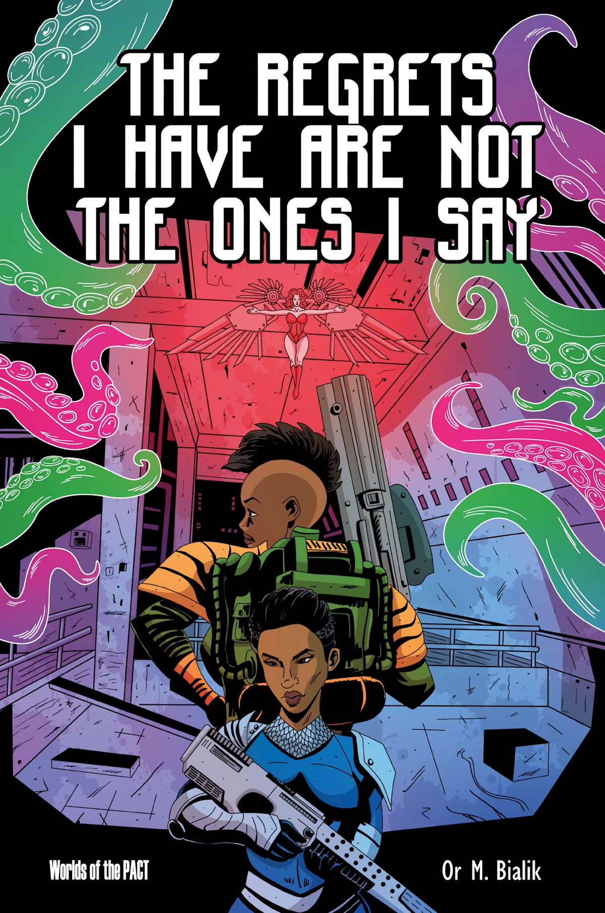
Ismat’s dating life is terrible, and a lot of it has to do with honesty. …
Content warning Izmat’s gender
Anyway, if you want to know before reading the book: Izmat ends up with big boobs, a dick, the genetic parent of an, at the end still unborn, child, the adoptive of three more, and as neither »he« nor »she«. In the Alliance, because, yeah, no, not in the Dominion.
Ismat’s dating life is terrible, and a lot of it has to do with honesty. …
Content warning The factions
So, the four sides of the three or four side fight: * »We«, Ismat and the security service, also the Luminary, who want to mostly keep the status quo * Babur Crus, who wants to bring back the ⸺ ceremony * Mothers Voice, who want to get rid of a some of the children of the Luminary, and also want a more restrictive society in genarl * Ishtar. While she is hinted to be behind Mothers Voice, she is pretty much a force on her own
Ismat’s dating life is terrible, and a lot of it has to do with honesty. Not that he doesn’t want …
Ismat’s dating life is terrible, and a lot of it has to do with honesty. …
I guess people pick this up as queer fiction before they do as SF. And we do get enough of Ismat slowly working out their gender (again): male wasn’t it, becoming female for a job is not that bad, but still not it. But what else is there in the Dominion?
Then there is the main or surface story: it starts with the security service (meh, but we are with the non-corrupt folks) learning about weapon smugglers, and end up with a three- or four-way fight that is close to bringing the Dominion to a civil war.
Also, great world building. The author’s description and charts are quite helpful. PACT #1 is (i think) set in the Empire with Alliance folks saving the day. This is set in the Dominion, with Alliance folks saving the day.